How Your NGO Can Make a Map
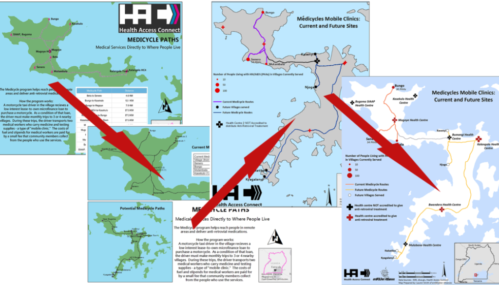
In this article, we’ll talk about the process we went through as an Executive Director of a health-focused NGO and a GIS (Geographic Information Systems) Mapping Specialist working with a global nonprofit, to: a) gather appropriate data, and b) create a map that improves our organization’s work.
We’ll talk about the difficulties that we went through and present tips about how some of our lessons learned. In the end, the goal is to have a database and data visualizations (e.g. charts, graphs, and maps) that present the problem you are trying to address, as well as monitor the impact of your programs. Not an easy task, but, oh so worth it!

There’s too much data to choose from! And none of it is what we want!
You may be implementing a program and are interested in certain variables (e.g. population, health indicators, disease prevalence, etc.) that are just not easily found where you are working. You may also have the problem that the data available are not very reliable or are not compiled in any useful way.
For our program at Health Access Connect, we set up monthly mobile anti-retroviral treatment clinics in remote villages in Uganda. We are interested in: a) HIV prevalence, b) default/attrition rates from anti-retroviral treatment (ART), c) the cost and difficulty for people to reach the nearest health centre, and d) the impact of our program on health outcomes and default/attrition rates. When we started to collect the information available, there was no data on the HIV rates at the village level. HIV population data was compiled at the health centres, but they were not collated to the village level, so it is impossible to use those data to understand HIV rates in particular areas.
Additionally, population data is difficult to come by, and population health studies of HIV prevalence rates are over five years old. When we apply for grants and try to describe the problem that we see on the ground, it’s difficult to do without reliable data! We were at a loss for what to do for many months. We know that there is a problem (lack of access to ART), but we have difficulty describing it to outsiders. We think that this situation may be fairly common for many organizations.

Find your questions
The turning point for us was making a strategic framework with the help of emBOLDen Alliances. They gave us a template and worked with us over time to complete it in accordance with our programming Of course, we were thinking: “Quit wasting our time! We’re trying to solve some serious problems here!” We saw the light and worked through the laborious process of filling out our objectives, thinking about indicators and outcomes, adjusting our objectives based on what we could gather, limiting our objectives to focus our efforts, and compiling it into a Strategic Framework. While it is still a work in progress and supposed to be just that as a living, breathing document, we were satisfied with it. It took us about two months to work through.
In terms of data gathering, that strategic framework activity very much helped us to identify the questions that we wanted to answer with data and how we would answer them. We had to make some difficult decisions to focus on data that we could gather and frame our questions and objectives around those data. For example, we always said that our main objective was to save lives by reducing default/attrition rates from anti-retroviral treatment (ART). Well, based on the data available to us, we can’t prove we have saved lives, nor can we prove that we have actually and causally lowered default/attrition rates. It’s just not possible to gather reliable data on those things in the places where we work. So, we had to come up with other indicators, such as distance from a village to the nearest ART clinic, number of patients served by mobile clinics, and frequency of patients having immune system blood tests (CD4 or viral load) completed. These are things that we can gather data on, and they are related to the positive health outcomes toward which we are working.
Another thing the strategic framework process did for us was to help us realize that we had objectives and indicators that were geographic, that is, we needed to collect geographic data and produce a map to monitor and evaluate our impacts. In our case, the objective was to “Increase the number of people living with HIV/AIDS who have access to anti-retroviral treatment within 5 kilometers of their homes.” In your organization’s strategic framework, there may also be objectives that require geographical data and [ahem] a map.

Make a list of what you have and what you don’t have
Based on that strategic framework and questioning process, you’ll start to make a list of what data you want, what data you have, what data you don’t have, and what data you’ll never have. It is also very helpful to review international standards of indicators for your type of program as well. Then, list it out! Listing it out will help you prioritize. We looked at the list of variables that we were interested in, and we were overwhelmed (we still are). We knew we couldn’t gather all the data we wanted. We’re a small NGO without the resources to dedicate many hours to data collection. But we were always visiting villages and health centres in the field, so we knew we could gather quite a bit ourselves.
Here are the geographic and population data that we knew we could collect and keep up-to-date:
- Locations of villages and health centres
- Populations of villages
- Populations of people living with HIV/AIDS (PHAs) in villages
- Number of PHAs served by each health centre
- Distance of villages to the nearest health centre
- Average cost of transport from villages to the nearest health centre
- Villages where our motorcycles are operating

Talk to partners about what you can do
The above list took a while for us to figure out. We kept going back and forth with health workers, community members, our partners at emBOLDen Alliances, and (of course) ourselves. We had to assess: a) what information would be ideal to collect and b) what information wasfeasible to collect for every place where we worked.
Once we had a list (much longer than the one above), we felt ready to start filling in the gaps and talking to a mapping and GIS specialist. The specialist gave us advice on collecting the data she needed to make the map. She also let us know that there is no published road data for the areas where we work. Since roads are so important to the work that we do, we had to collect information ourselves and feed it to her to map out the roads.
Figure out what you want in your map
Once deciding that you want to use GIS and make a map, there are a few key questions that you and a mapping specialist can work through. We present our answers to these here:
- What is the primary purpose of the map and using GIS software?
Present the current scope of Health Access Connect’s work and population health data. - What type of data do we need to gather?
GPS locations of villages, GPS data of routes between villages and health centres, population data of villages, PHA population of villages, and the other variables listed above. - Do we need to collect it ourselves or can it be found online?
We could get some population and health data from government officials, but we had to collect information of people living with HIV/AIDS in each village and all the location and route data. - How do we collect the data?
To get the locations and routes, we just used a GPS tracking app on our smartphones — e.g. My Tracks on Android, Trails on iOS. To get data on PHAs, we collaborated with partners in villages to get their best estimate of the number of people. - How do we share the data?
We used Sheets on Google Drive. Our mapping specialist could easily see what we had, ask probing questions, analyze certain raw data, and then plug all of that into the map. - Where do we want to publish the final product(s)? Who’s the audience?
We wanted two maps as follows:- one for the general public showing where we do our work and giving people of an idea of the population that we are serving,
- another for our staff, potential donors, and specialists who are interested in the finer details of the work that we do.)

Making it clear, pretty, and publishable
At this point, you will have done A LOT of work to reduce all the information that you can collect and put into the map. This is a good time to revisit the question of “Where are we going to publish this map?” Our answer to that question changed a lot. In the end, we published it in thefundraiser explainer on our website. That allowed us to remove a lot of information from the map, like the data table and the explainer, because that information wouldn’t be necessary, or we could add it on the webpage.
After all that work, we still wanted it to look cool! To do that, we went to Google Images and found a good-looking map that we wanted to copy. That example made it easier for us to talk to the GIS Mapping Specialist about specifics. We had to change some of the colors around since we were adding red crosses, using a map we liked as a guide.
After we had that, we exchanged a lot of discussion around the key, removing things, making text clearer, etc. You should expect a lot of work, so that you and the Mapping Specialist come up with something that is very clear. When you finish drafts, you should ask friends and colleagues to read it and explain what they do and don’t understand. If it’s not clear, change it!
In the future, we hope to build on this map as we add more motorcycles and clinics. We also aim to embed the map on our website using dynamic tools like Open Street Map and Google Maps.
Finally, the other key issue is to revisit that strategic framework for our program, make adjustments to it in accordance to the data we can collect and hope to collect in the future. We also plan to revisit the various categories listed there to make certain that we are measuring what we think we are and measuring what is most useful and effective. As the old adage goes, bad data in means a bad map out, and so it is the same with creating and implementing good programs.
We hope this post has been helpful. If you have more specific questions please contact us through the HAC Contact Form.

This post was written by Kevin Gibbons of Health Access Connect and Lauren Smith of emBOLDen Alliances.
It is cross-posted at emBOLDen Alliances blog as How Good Data & Good Mapping Inform Each Other (and Lead to Great Programs).


